
DOPE MAGAZINE Logo Design & Original Branding
In the summer of 2011, 8th Day Create was commissioned to create the name, original branding, art direction, and style guide for a cannabis lifestyle magazine.
These ideas became DOPE Magazine, with DOPE being an acronym for "Defending Our Patient's Everywhere". The acronym idea was contributed by one of the founders, Trek.
These ideas became DOPE Magazine, with DOPE being an acronym for "Defending Our Patient's Everywhere". The acronym idea was contributed by one of the founders, Trek.
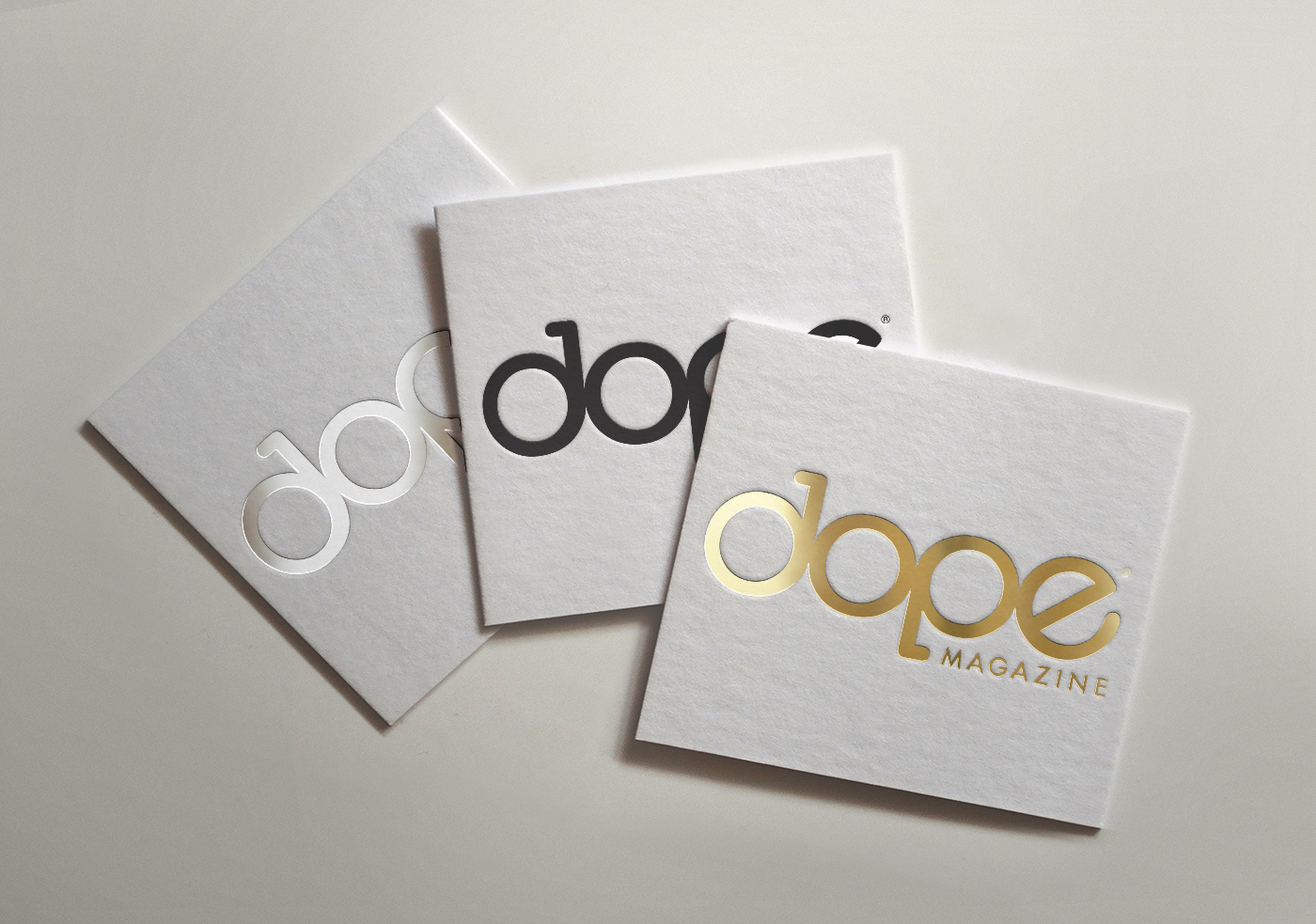
The inspiration behind the logo was to be a workable bong piece. The logo has been in use since 2011 and continues strong in all its presence today.
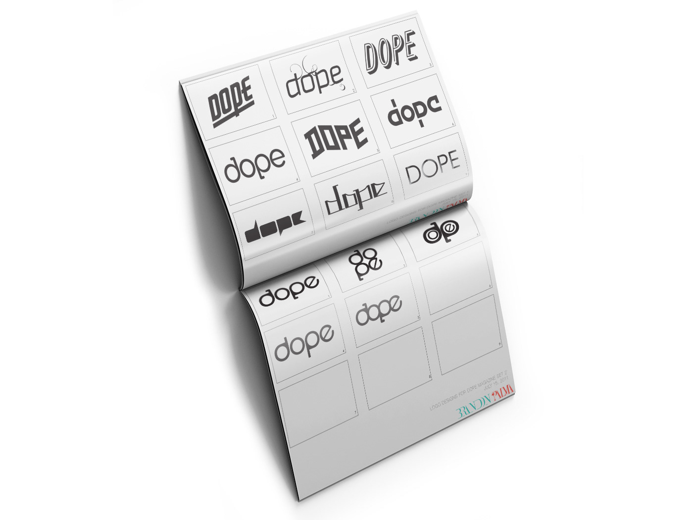
Dope Magazine Logo design concepts, July 15, 2011.

"DOPE LIFE" New acronym branding, Fall/Winter 2016-Present
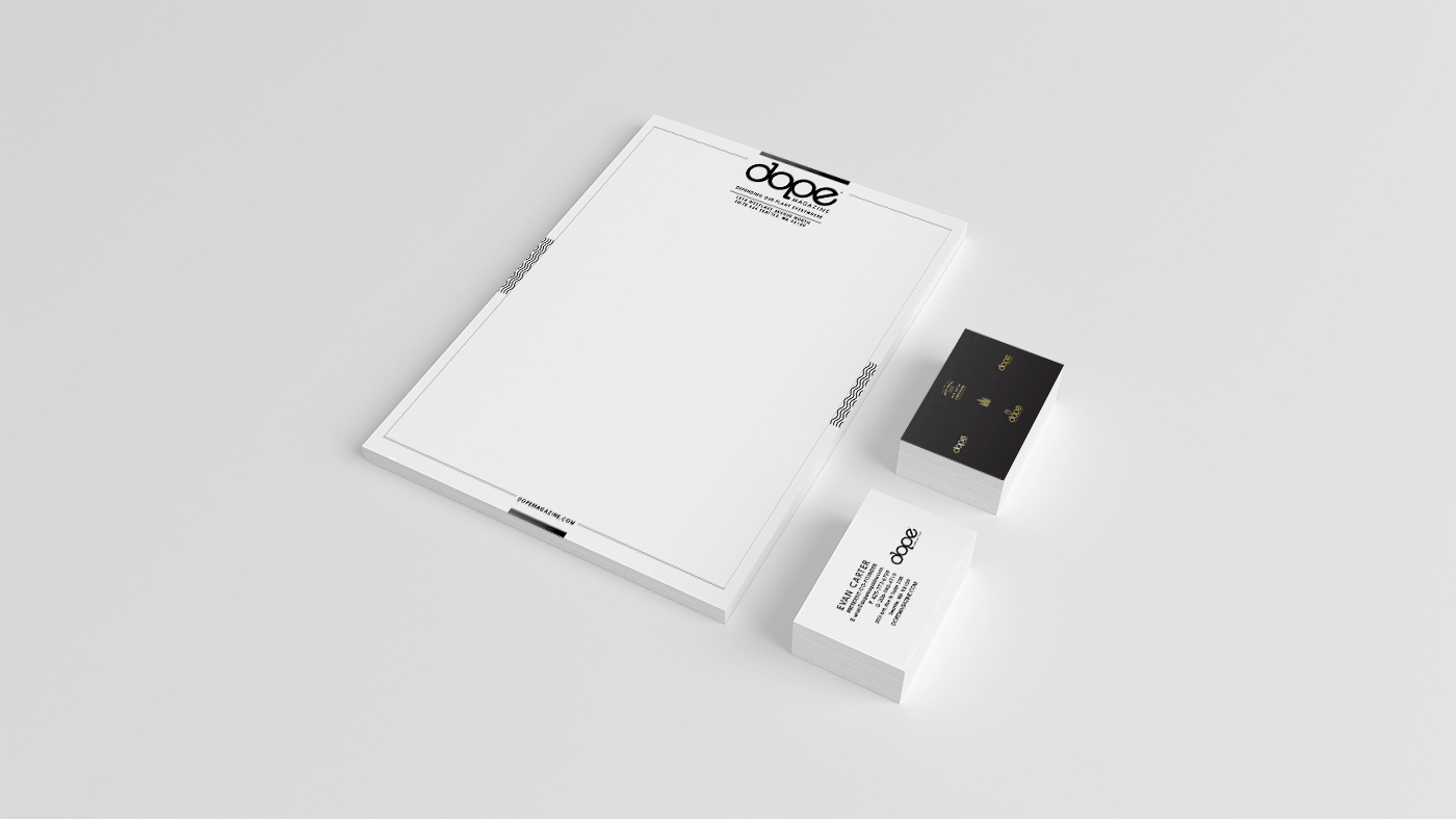
Business Card & Letter Head Set.